Monotonically Increasing Application IDs
This post is about something I’ve seen take several forms during application tests. It may affect application-level session IDs, or it could be some other token, or, as in this case, part of the web infrastructure that supports the application. While this isn’t a high risk vulnerability, per se, it is of interest in terms of secure application design. Rather than describe it, I thought I’d show you what it looks like.
Varnish Cache is a popular web server accelerator. It sits in front of a web server as a proxy, caching content, and generally alleviating the burden on the back-end web service. It provides many gains in performance, ranging from an elegant caching approach to cost-savings from it’s logging architecture. It is the latter that concerns us today. In the last scan I did, I found that about 6.27% of the top 10,000 Internet sites run Varnish.
If you make any regular HTTP request to a web server accelerated by Varnish, you’ll see it look something like this:
$ curl -I http://<URL>/
HTTP/1.1 200 OK
Server: Apache
Content-Language: en-US
X-Mod-Pagespeed: 1.2.24.1-2383
Content-Type: text/html;charset=UTF-8
X-Varnish: 1976139169 1976126578
X-Cache-Hits: 605
dclass: unknown
Expires: Tue, 08 Apr 2014 00:02:17 GMT
Cache-Control: max-age=0, no-cache, no-store
Pragma: no-cache
Date: Tue, 08 Apr 2014 00:02:17 GMT
Connection: keep-alive
See that X-Varnish: 1976139169 1976126578 header? That’s added by Varnish to help administrators debug caching issues. The first number tells you the current transaction ID. Essentially, every HTTP request is assigned this number so that the Varnish tools can keep track of it, especially with logging. The second number tells you the transaction ID that generated the cache entry that Varnish returned (rather than bothering the backend server). Or at least, that’s how it seems to work based on the documentation (I’m no Varnish expert).
Here’s how to collect a bunch of these at a time:
while true; do
    echo -n "`date` "
    curl -s -I <URL> | grep X-Varnish | awk '{print $2}'
    sleep 30
done
Here is a sample of these IDs over time. The following graph shows about 100 data points. You can see some interesting variation:
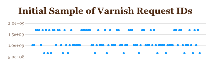
It looks pretty flat, with IDs having about three values, somewhat unpredictably spaced over time. This isn’t the whole story, though. If we take the top-most group of these and graph them without the rest of the ID samples, we get a very different picture:
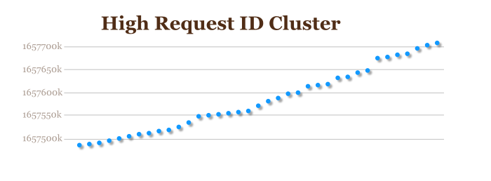
Now it’s getting much more interesting. The XIDs are monotonically increasing – that is, they only ever go up. For a little extra confirmation of this, here’s a snippet from the current Varnish source code:
static int
cnt_start(struct sess *sp)
{
        uint16_t err_code;
        char *p;
        . . .
        /* Assign XID and log */
        sp->xid = ++xids;                               /* XXX not locked */
        WSP(sp, SLT_ReqStart, "%s %s %u", sp->addr, sp->port,  sp->xid);
Every time a new request comes in, we just use the next transaction ID. But why do we see three different streams in the sample from earlier? Well, it get’s a little more complicated than this. Varnish is multi-threaded, and there may be multiple cache pools in play at any given time. This is why the chart above shows three different distinct tracks of transaction IDs. This is quite normal with this type of behavior – e.g., session IDs that increment will have different values for each load-balanced back-end web server.
What’s interesting is that, since the IDs are monotonically increasing, we can extract some information about the behavior of the web service. For example, if we see the number go up a little bit between samples, we know there has been light traffic. If it goes up a lot, we know traffic has been somewhat heavier. While there are some quirks, the changes in the transaction ID over time are a usable metric of the site’s traffic volume.
We can definitely extract this information, and generate interesting results like the following. This shows three graphs for the web server where I collected the 100-point sample above, only this sample is a 24-hour period. By separating the data points into three groups and comparing changes in transaction IDs and dividing by elapsed time between samples, we can measure the average number of requests per second:
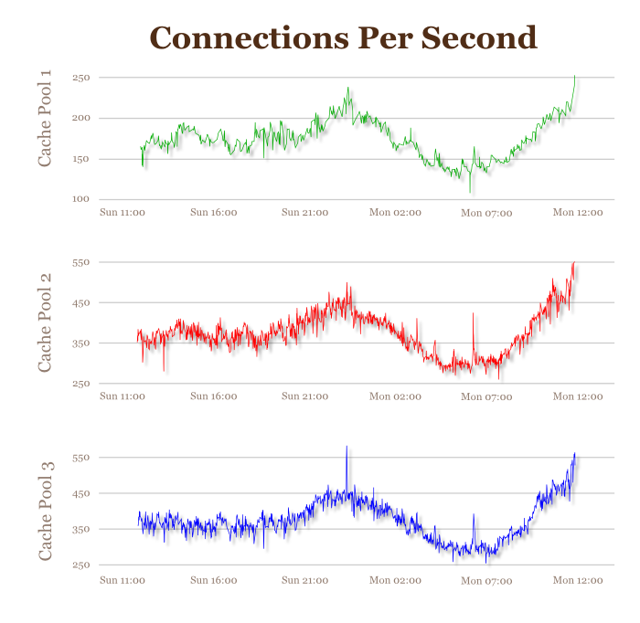
I thought that was quite nice. The traffic spikes for Sunday night, then dips very low through the wee hours. Around 7:00AM (CDT), traffic starts to pick up again for the daytime rush. There are also some other interesting things – the real import of which are unknown to me. For example, for this (anonymous) data set, the three cache pools behave differently. One receives half the total traffic of each of the other two:
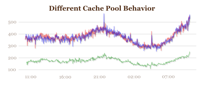
I’m really not sure what it means. But it’s interesting!
So why do I care? What’s the significance of this type of behavior – from a security perspective? Well, in some ways not much; in some ways, quite a bit. It really depends on what you’re looking for.
For example, there’s been a bit of kerfluffle over the healthcare.gov rollout. How many people are using the site? Well, the feds decided to hide the QuantCast profile to prevent disclosing the traffic levels. Healthcare.gov doesn’t run Varnish, but if it did, we could probably get a good idea of what it’s traffic levels were like.
Or perhaps you’re just interested in the usage pattern for a target web site. If you can find out what busy times are, or slow times, that’s information you wouldn’t have had otherwise. You also might be able to measure response times compared with request load, and find peak times where performance is stressed so you can stage a DDoS attack.
Or again, maybe you can compare the load between multiple instances of the site, and find the one with the least (or the most!) load. These kinds of indicators can be very interesting to a sophisticated attacker.
BTW, if you consider this unacceptable for your site, you can disable the X-Varnish header. Many sites do this for a variety of reasons. The Varnish project enables the header by default to support debugging activities, so turning this off might be a good hardening step.
“Hey,” you might say, “That analysis looks very manual.” So far, yes. “Can that analysis be automated?” As a matter of fact… sort of! The way I actually processed this data set was with an automated technique. As I said, I’ve found other instances where this type of analysis proves useful, so having a methodology for conducting these tests in automated form speeds things along.
The key aspect of this analysis is in identifying the different groups of incrementing IDs. This can also apply if you have monotonically increasing fields in session IDs that vary from one load-balanced back-end web server to another. You need some way to figure out which ones are grouped together. In this case, I had three groups, but there could have been a lot more. And I can easily find some partitions in the XID space to manually bin them, but this requires me to slice it up myself.
In the field of data mining, this is a classic problem – cluster analysis. It seems that the world is filled with datasets where there is some inherent order, but it’s not easy to find it when the dataset gets big. Fortunately, there are some well-established methods for doing this. I chose k-means clustering.
This is a handy technique where we pick some arbitrary “center” nodes that might be the middles of clusters. We then throw all the other datapoints into groups based on their distance from these “centers”. We then choose new centers based on the distribution of the data points, and reiterate. We keep doing this until it seems about right (there are various ways to decide).
Here’s a sample from my code, written in GNU R:
getgroups <- function(data, num) {
    km <- kmeans(data$ID,num)
    lst <- list()
    for(i in seq(1,num)) {
        g <- data[km$cluster == i,]
        o <- as.vector(boxplot(g$ID)$out)
        g <- g[!(g$ID %in% o),]
        lst <- c(lst,list(g))
    }
    lst
}
GNU R is very handy for this, since there’s a kmeans() function – I really don’t have to do any work at all. Essentially, what this function does is perform a k-means analysis of the “ID” field in the dataset, then remove any outliers that get in the way (that’s the for-loop in the middle). Once I have the data points broken up into groups, then I can simply calculate time intervals, divide ID-intervals into them, and we’re all set.
You can look at the rest of my code if you like. Bear in mind that it’s pragmatic – not a polished, production-ready tool. But it’s enough to get a sense for how this works.
Note that there are some idiosyncrasies. Some places have modified Varnish so that it doesn’t show what you might expect based on the documentation. For example, I found some where the fields are out of order, or there are extra fields. Sometimes you have to apply a little extra effort in figuring out what’s there.
Also, as mentioned before, not all sites running Varnish will show you the X-Varnish header. It can be disabled (I would if it were my site).