The Shape of Network Traffic
I am working on a (probably foolhardy) project to play with network traffic at a very low level. It’s hardware, and so I’m trying to estimate performance. Given a CPU with speed X and choosing parallel bus architecture Y on the MAC/PHY, how much time do I have to process a packet, etc., etc. Estimations are only worth the information you use for the basis, of course; so I collected a network capture from a pretty busy and large network so I could get some idea of what’s “normal”. I was quite interested in what showed up.
I’ll preface this, also, by saying I have no amazing analysis or conclusion here. Only the observation that there’s some interesting structure in packet flow, and it startled me. I certainly watch the packets fly by in Wireshark often enough, so I thought I had a good idea of what things would look like. I wanted to answer a key question for my project: how many microseconds do I have between packets to analyze (and manipulate) them? This influences decisions I’ll make about packet buffering and how complex I can make the processing stage.
So like I said, I collected this network capture. It’s about two hours of traffic from a production network with between 100 and 200 users. I extracted the timestamps from the PCAP and wrote a quick Ruby script to convert timestamps to delta-t values (and byte sizes, etc.). But how to visualize it? I pulled out GNU R, and thought I’d just try the default plot() command:
plot(d$Delta, pch=16, ylab=’Time Between Packets (uS)’, main=”Plot of Time Deltas”)
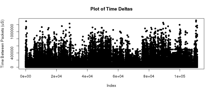
That was interesting enough, but I could see several things. First, the data is spread out over a huge range: inter-packet times range from 0 to millions of microseconds. And lots of the data must be on the lower end, so I thought maybe I’ll rescale it with a logarithmic Y-axis. This should show me what the bottom looks like:
plot(d$Delta, pch=16, ylab=’Time Between Packets (uS)’, main=”Plot of Time Deltas”, log=’y’)
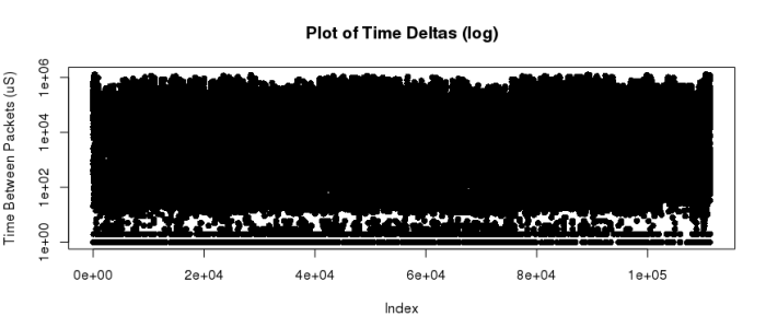
Wow, that’s just a ton of data. I don’t want to start aggregating it – I did try a histogram, and I basically get one big bar in the first bin and a long tail. Totally useless. Then I remembered a trick I ran into when I was running profitability metrics for delivered services at a previous company where I worked. I had thousands of data points, and I wanted to see instinctively how the shape really worked out. By setting the plotted points with a mostly-transparent color, they don’t just clobber each other like in the above graph. Check this out:
plot(d$Delta, pch=16, log=”y”, col=”#00888803”, main=”Packet Flow”, xlab=”Packet Index”, ylab=”Time Between Packets (uS)”)
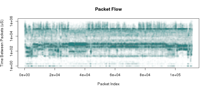
And there we have it – a fantastic image. It shows that there are common streams of traffic that strike at very regular packet intervals. Temporal clusters with consistent bursts of packets of nearly constant timing. My guess is (without the much more complicated deeper analysis) that these horizontal stripes associate with traffic in-subnet, out-of-subnet, or by protocol. For example, TCP comms ACK every packet, so a TCP session should show up as pairs (or clusters) of packets tightly associated with each other. I simply had no idea there would be so much obvious structure in this somewhat non-sensical graph.
Here’s where I finally ended up. I had estimated, based on propagation delay timings on the MAC/PHY chip I am looking at, along with cycle times and MIPS/mHz for the CPU I’m planning to use, that I need a worst case of about 600 nanoseconds to read, process, and rewrite a packet byte. So I rerepresented this information as microseconds per byte, and plotted my line. I am confident that with “reasonable” buffering (the MAC/PHY buffers in its own memory, for example), I should be able to keep up with a real-world network.
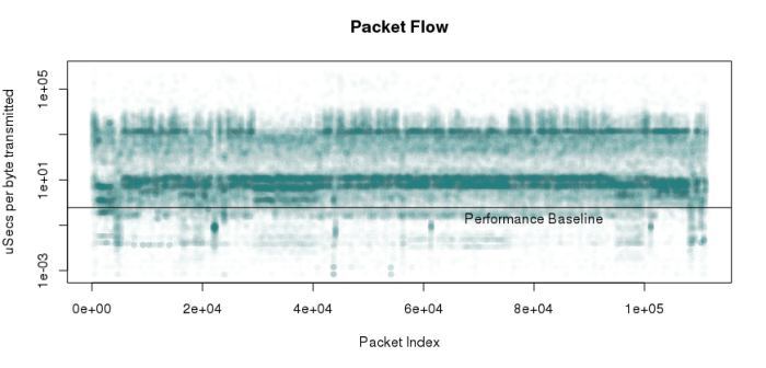
Note also that this basically combines information about packet timing and packet size. I know that this trace includes a variety of interesting traffic:
- Port scans (I was portscanned, not doing the portscanning!)
- SMB file sharing
- Web browsing
- Tons of broadcast and multicast
By the way, for extra points, see if you can guess when my box was portscanned by looking at the sequence.