Acclimating JS8 to Raspberry Pi
Operating in ham radio, my favorite thing so far is the rag chew. Longer conversations, where you get to meet someone, learn about them. Really, the biggest reason I got into ham radio was to connect with a community of nerds. So of course, JS8 is one of the most wonderful digital modes, allowing conversational communications even with sketchy propagation and bad conditions.
One frustration I’ve had, though, is that I run my transceiver with a raspberry pi at a lower resolution over VNC. With the default look and feel, the JS8Call software is not ideal. The spacing is wasteful, and the colors are not particularly pleasant. This past week, I spent some time customizing JS8Call, and I think I’ve got some pretty good enhancements to the U/X going on. I thought I’d share what I’m playing with in this post.
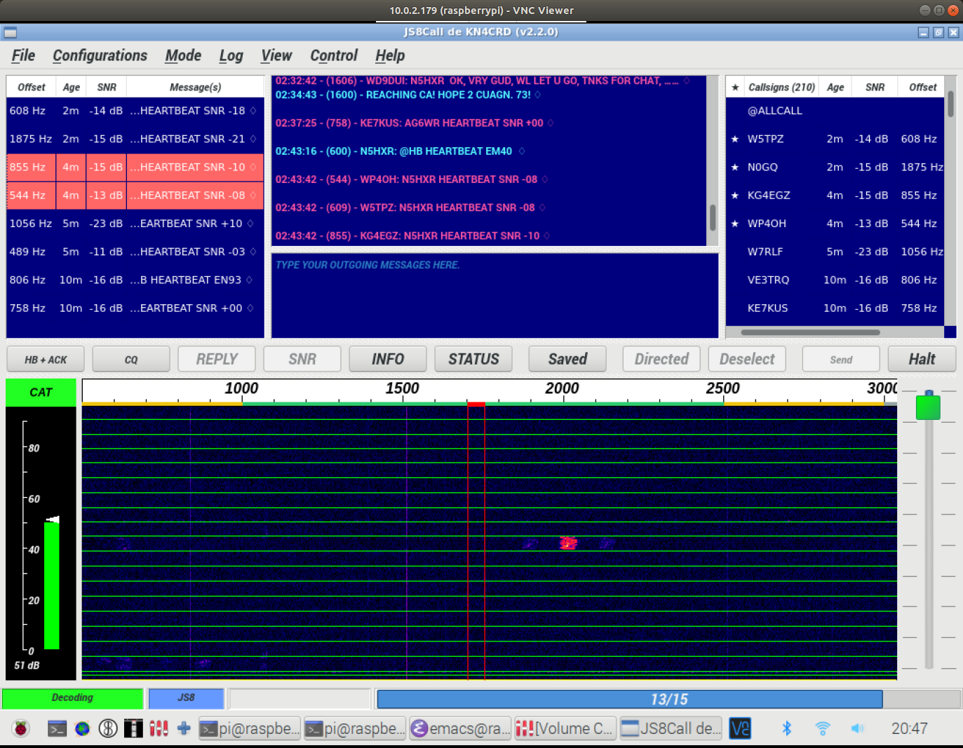
First, here’s what JS8Call looks like to start with (actually, I think this has a couple changes to the colors, and the Sunburst palette for the waterfall, but by and large this is what a normal JS8Call might look like):
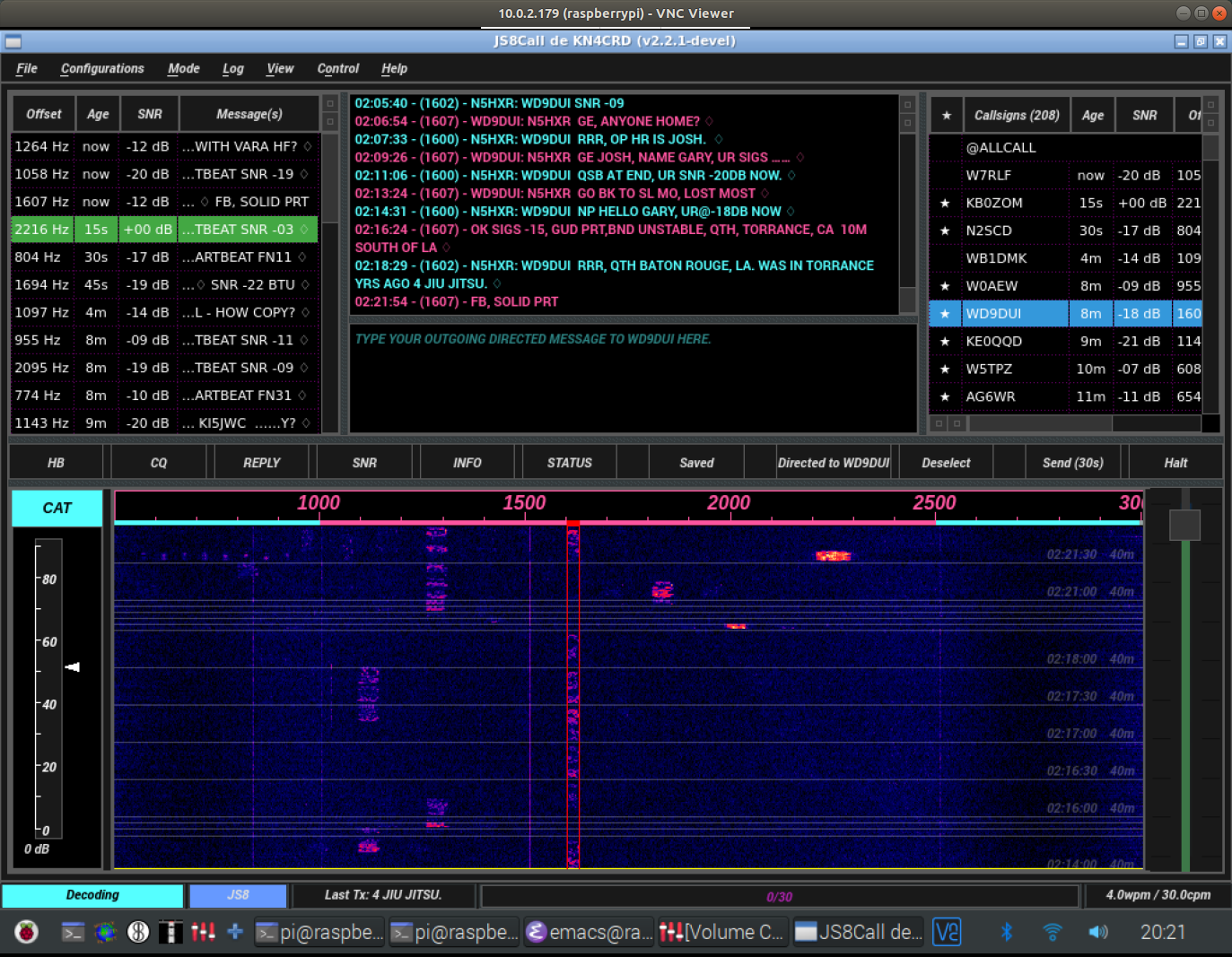
I grabbed the source code, and started playing around. It’s not a small codebase, but most of the GUI is in a couple files. The main one is mainwindow.cpp. I tweaked a number of things, which I’ll list below. To start with, here’s the result, which I think is a pretty attractive remix of the JS8Call GUI:
The main things I did were:
- Implement a dark theme. Some customization is possible in JS8Call itself, but I had to make a number of source changes. A bunch of the colors are hard-coded. I was trying to shoot for a dark mode visual that wouldn’t be too jarring on the eyes. The other main change that achieves the dark mode was integrating support for an external
.qssfile (a stylesheet for QT GUI apps), which makes it somewhat easier to tweak settings without recompiling. - I changed the waterfall lines from a solid bright green to a partially transparent gray. This means I can increase the averaging on the waterfall, and get lots of transmit windows visible, without the lines dominating the visual. I also moved the timestamps to the right side, as there’s often enough some activity in the heartbeat band at the left. It seems better to get an unimpeded view of that action!
- I tweaked the padding on the tables at the top-left and top-right. With my current window layout, it packs in another two or three rows, and it’s just a lot less wasteful of screen space. I’m not a QT genius (wish I was!), otherwise I’d compress them even more, if I could!
- The blank lines between transmits on the messages window is extremely wasteful of space! The code just adds a blank paragraph in between, each time a new message comes in. I just took that out… I much prefer getting the text back to back so I can see more of the conversation history at one time.
I’ve been running this view for a couple days, and find it a lot more pleasant. This is especially so at night, when the lights are down, and the dark mode theme is much less strain on the eyes.
Unfortunately, most of what I’ve done so far is to change hard-coded values in the source code. While JS8Call has support for some customization, a lot of the things you’d want to change just aren’t included. I’ve been thinking about what it would take to generalize what I’ve done, augment the configuration screens, etc. If anyone else ever wanted to tweak the same things, it might be worth it. For now, I guess I’m running my own fork locally.
Anyway, if anyone reads this and has thoughts on the GUI, or is interested in my customized version, feel free to contact me and chat about it.